Hozi sauce
Directamente desde una cocina casera en Kinshasa, la picante y sabrosa salsa Hozi pili-pili nació en 2012. Creada por Hoziba Chifundera Hortense, esta receta casera ganó rápidamente seguidores gracias a sus audaces y exóticos sabores. Ya sea añadida a guisos, boloñesas, tajines o mezclada en mayonesa o salsa tártara, Hozi aporta un toque distintivo a cualquier plato. Lo que comenzó como una creación culinaria personal ha evolucionado hasta convertirse en una prometedora marca local de alimentos, atrayendo ahora a una comunidad creciente de amantes de las especias.
- Sitio web
- Food & Restaurant
- Standard
- Logo
- Fotografia
50:00 horas
Our mission
The Hozi project was about much more than creating packaging—it was about transforming a personal recipe into a brand with real market potential. From identity to shelf presence, every design choice was rooted in Hortense’s story, her product’s uniqueness, and the cultural roots of the sauce.
We began by working closely with Hortense to understand the essence of Hozi: a powerful, homemade sauce full of personality and tradition. This insight guided the creation of a visual identity that would not only speak to the product’s spiciness but also express authenticity and pride in its Congolese origins.
The centerpiece of the branding effort was the Hozi logo—a simple yet striking mark featuring a flame, symbolizing the heat and energy of the sauce. From there, we developed a full visual language: typography, color palette, and packaging style that would support the product's character and stand out in the crowded supermarket space.
Once the identity was in place, we moved on to packaging and label design, ensuring that the final result was not only visually compelling but also compliant and functional.
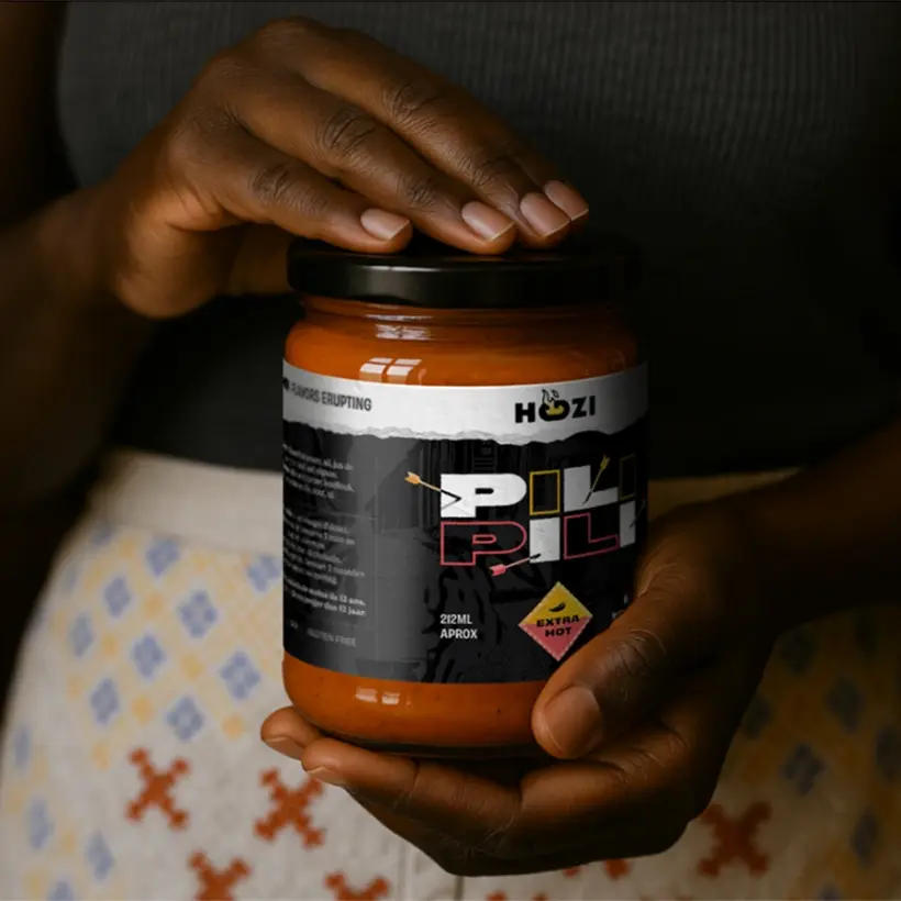
The launch was a success: Hozi sauces made their way into various supermarkets across Brabant Wallon, Belgium, with customers—and our team—quickly becoming fans of the bold flavor and equally bold presentation.
![]()
01
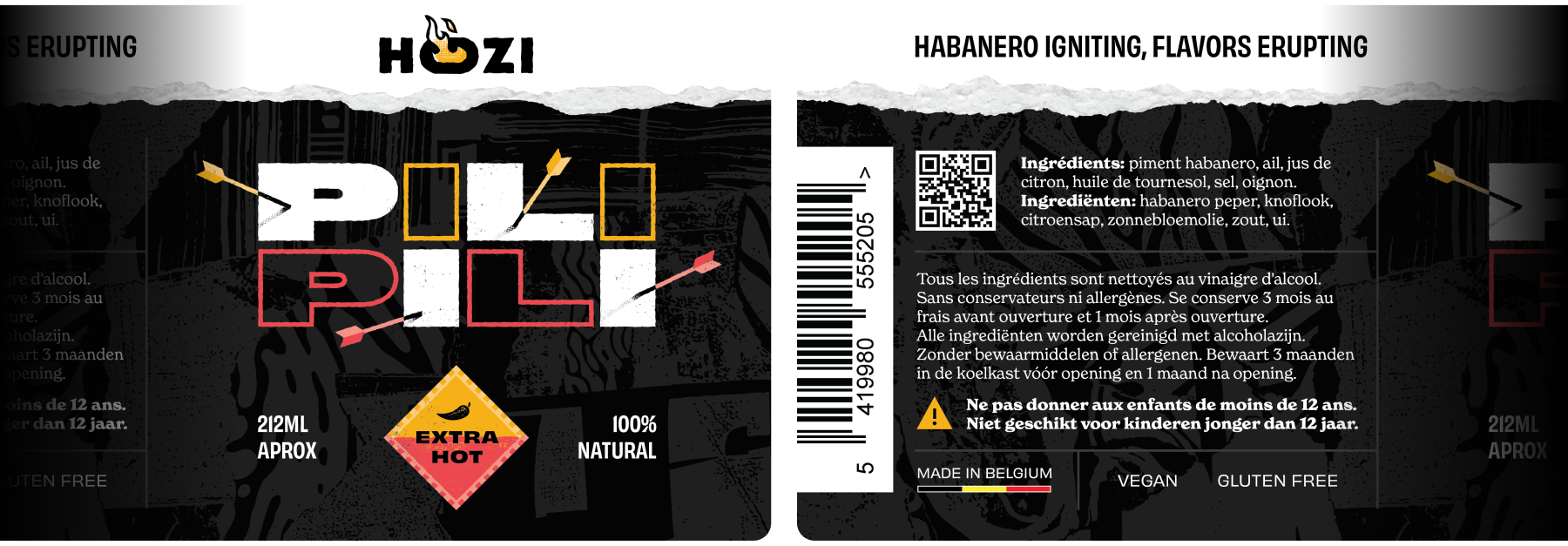
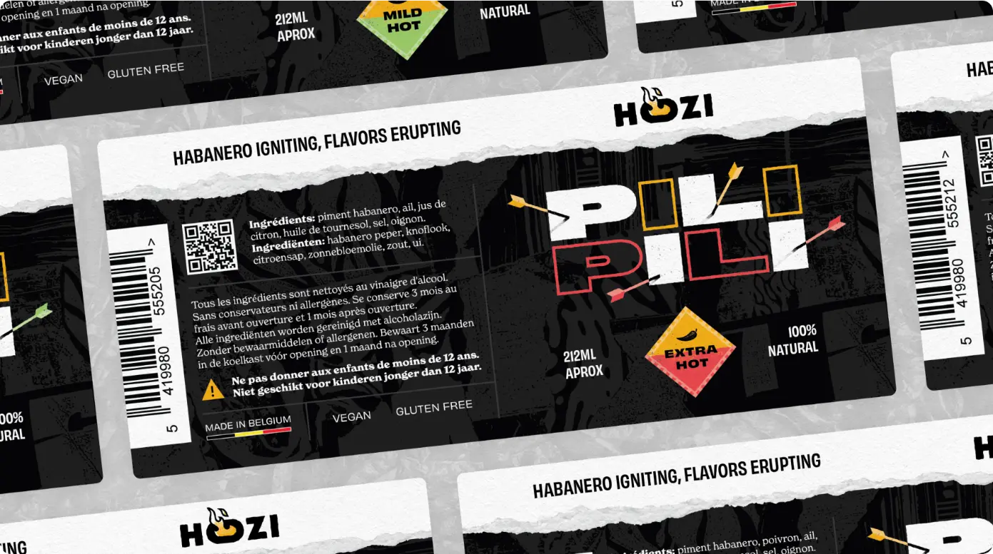
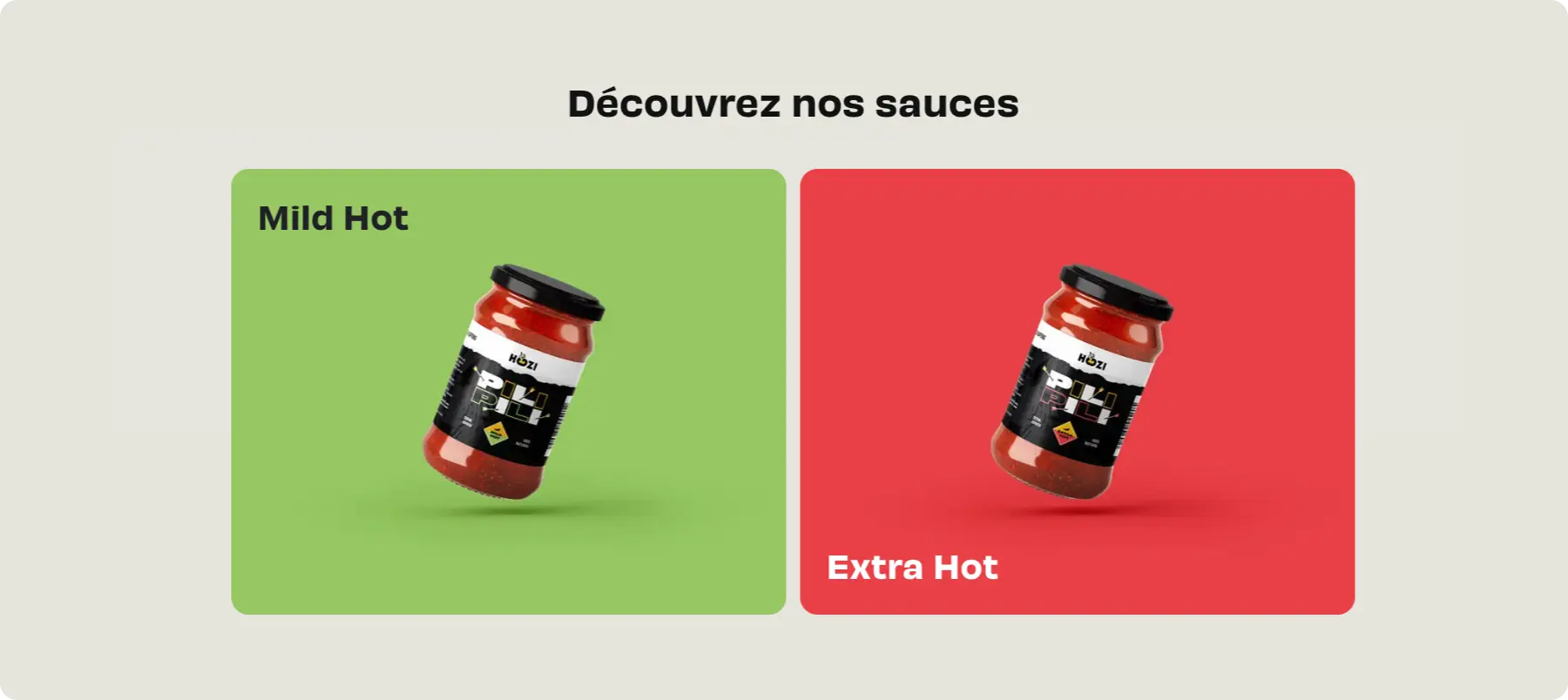
Product Label Design
Development of two labels—Extra Hot and Mild Hot—with designs that reflect intensity while incorporating subtle references to Kivu, Hortense’s region of origin.
02
Packaging & Regulatory Info
Labels were built to balance design with clarity—ingredients, quantities, and allergens were presented clearly and accessibly.
03
Photography
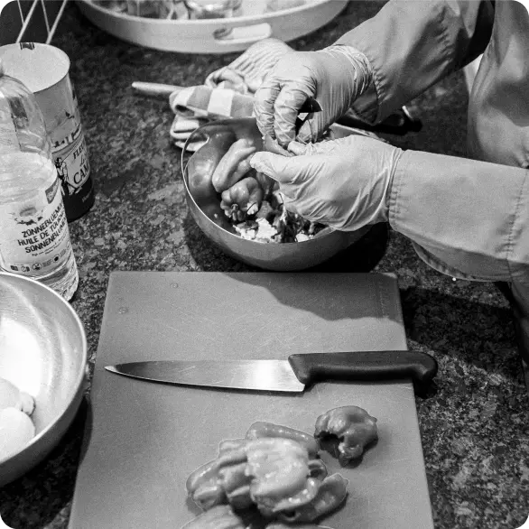
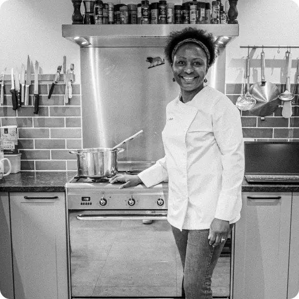
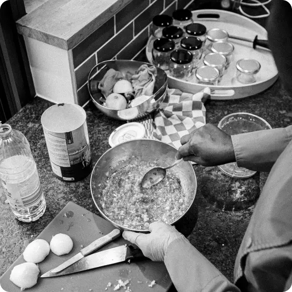
We also documented the behind-the-scenes process of making a handcrafted spicy sauce. The goal was to tell the story of the sauce from raw ingredients to bottled product—highlighting the textures and intensity that go into every jar.
We shot everything in her own kitchen, the same space where she crafts each batch by hand, giving the sauce its homemade character and authentic, small-scale charm.
04
Website
Last but not least, we setup a simple website to showcase the 2 sauces that she produces. It might become an E-commerce in the future.
Similar projects
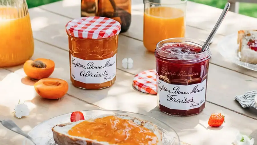
Bonne Maman
- Food & Restaurant
- Personalizado
- Sitio web
- Ecommerce
- Blog
Bonne Maman es una querida marca de alimentación francesa fundada en 1971, conocida principalmente por sus icónicas mermeladas y conservas vendidas en sus característicos tarros co...

Sakaya
- Food & Restaurant
- Personalizado
- Sitio web
- Ecommerce
- Blog
Sakaya.co tiene la misión de preservar la cultura del sake japonés conectando directamente las bodegas de sake con los consumidores de todo el mundo. Al eliminar los pasos innecesa...

Julie’s House
- Food & Restaurant
- Personalizado
- Sitio web
- Ecommerce
Julie’s House nació del sueño de infancia de Julie de tener una casa de muñecas hecha de pastel. Impulsada por su pasión por los dulces y perfeccionada con su formación en pasteler...